BP Universal EV Charging App
Redesigning the 'Add Vehicle' function for BP's universal EV charging app, creating a seamless user experience from research to high-fidelity prototype.
Overview
In a job simulation for BP, I assumed the role of a senior designer tasked with contributing to the overall user journey for a universal EV charging app. My responsibilities included conducting research, creating user personas, developing low-fidelity wireframes, designing the UI, and producing a high-fidelity prototype.
Goal
As part of enhancing the user journey for locating the nearest EV charging station, I focused on redesigning the feature for adding a vehicle to the app. The objective was to create a prototype that, within the given time constraints, closely resembled a fully developed app, ready for user testing.
Process
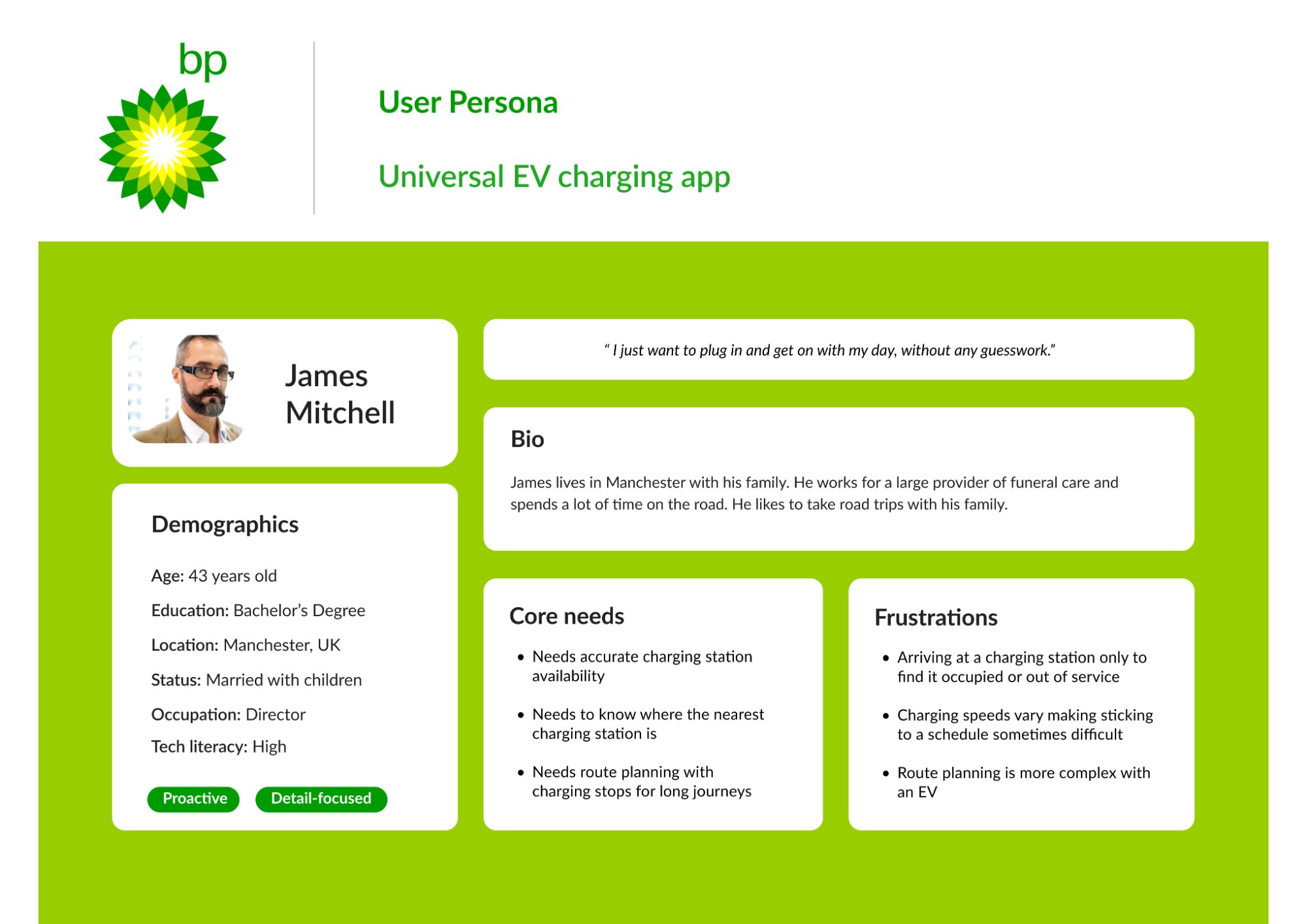
1. Persona Development
To prepare for this project I looked at some competitors first to understand what features EV users need when searching for a charging station. Combined with existing research I created a persona to help inform design decisions.
The persona—James Mitchell, a 43-year-old director from Manchester—represented our target user: someone with high tech literacy who spends significant time on the road and needs reliable charging infrastructure for family road trips.
Key user needs identified:
- Accurate charging station availability
- Knowledge of nearest charging stations
- Route planning with charging stops for long journeys
Core frustrations:
- Arriving at occupied or out-of-service stations
- Variable charging speeds affecting schedules
- Complex route planning with EVs
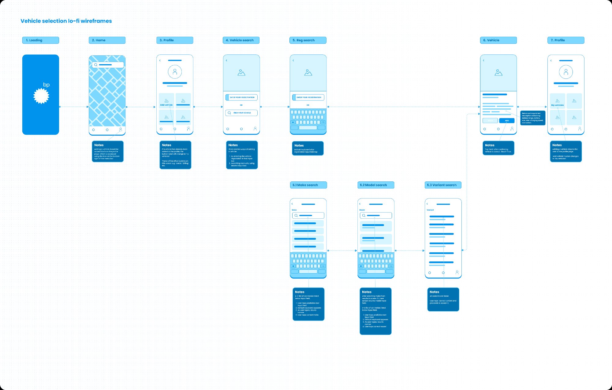
2. Wireframes
Building on my research and competitor analysis, I began by sketching initial screens and user flows by hand. Once I identified a preferred flow, I translated these sketches into a set of low-fidelity wireframes. At this stage, the wireframes were detailed enough to guide the development of a prototype.
The focus was on key elements and interactions, with annotations highlighting how users would navigate from one screen to the next.
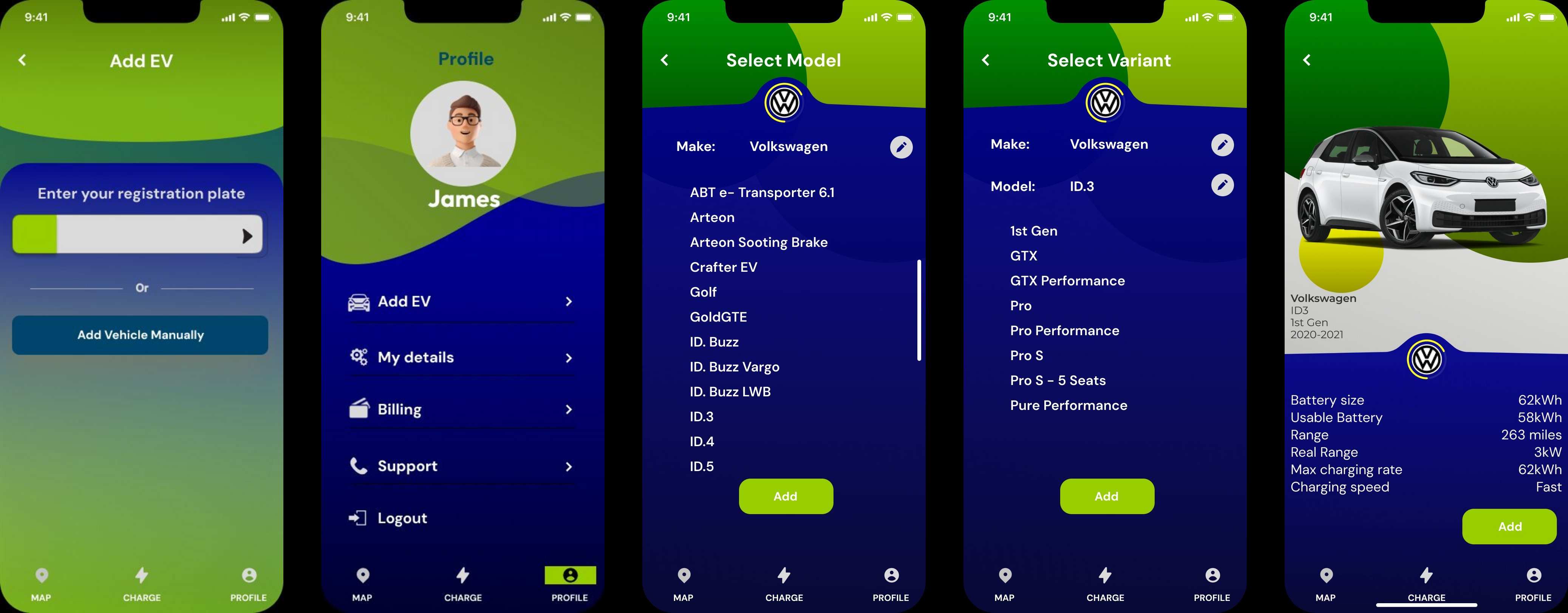
3. UI Design
After validating the wireframes and flow, I transitioned to designing high-fidelity mockups that could be tested with users and shared with stakeholders for approval. The mockups needed to be detailed enough for the engineering team to assess the timeline and budget required for development.
Throughout the process, I kept the user persona in mind and referred back to my research. The UI had to use standard interactions and patterns for iOS that are familiar to users, so the app is intuitive. Reviewing competitor solutions also provided valuable insights.
I ultimately chose a clean, simple design that aligned with BP's existing brand identity—using their signature green with a modern dark blue interface.
4. Prototyping
Using the high-fidelity design, I created a simple, single-task flow prototype that allowed users to click through the interface, demonstrating how the app would function. The prototype needed to be refined enough for a lead to share with various teams, showcasing both the app's appearance and functionality.
Each screen featured only one interaction, moving the user to the next step, ensuring the prototype closely resembled the look and feel of a fully developed app.
Learnings
While I was already familiar with most of the processes and skills involved in this project, it provided a valuable opportunity to further develop my UI design skills. The tight timeline of just one day reinforced the importance of efficient workflows and making decisive design choices backed by research.